


Adobe’s Hidden Treasures – Bauhaus.
Design challenge #5: Brand identity project on Behance
Original typography sketches and unpublished letter fragments from the legendary Bauhaus school of design were recently rediscovered. Adobe, in conjunction with Erik Spiekermann and his team of students have recreated and digitised five new alphabets from this base material. To celebrate and promote this, Adobe released the fonts and set five challenges.
The final challenge was to create a Behance project collecting together all the previous challenges. This project is shown here.
I had originally presented each challenge separately at the time to meet the submission deadlines. As the event is now finished I have chosen to condense the options and use this project page as a way of showing everything together.
It was fun, I hope Adobe comes up with more of these challenges.
Design challenge #1: Logo
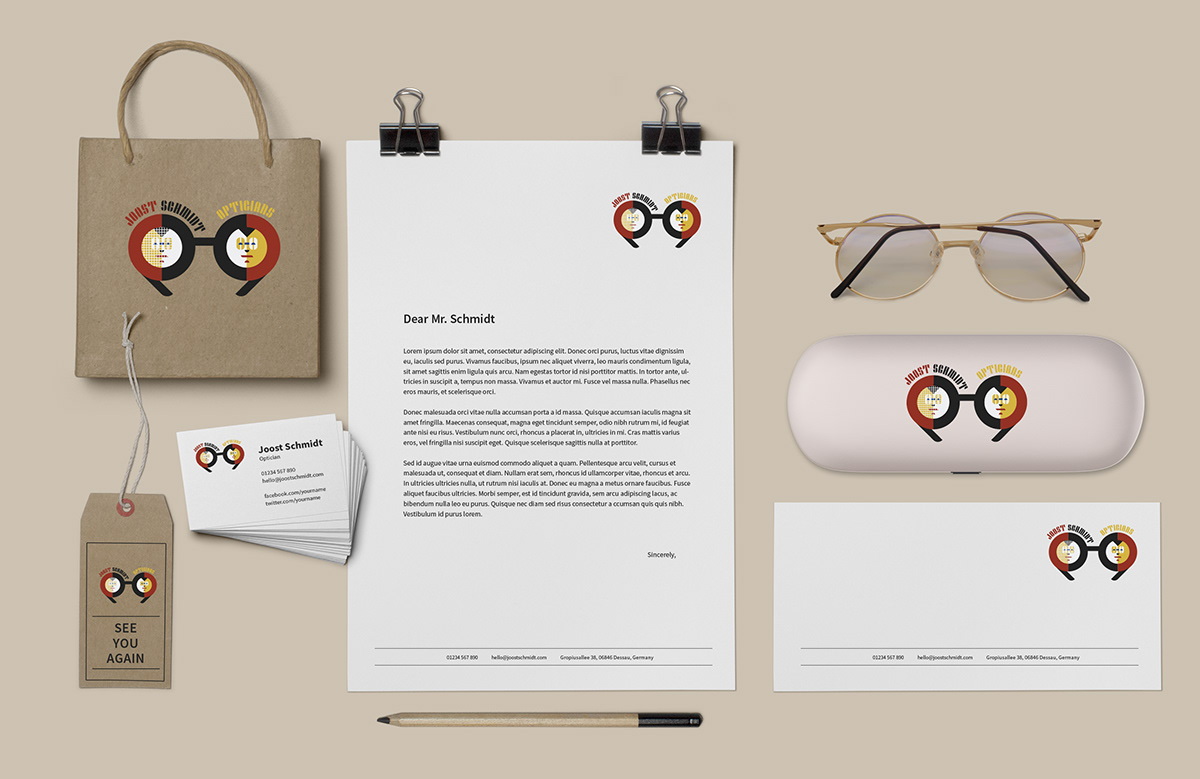
I finally chose this logo after initially presenting three.
This challenge was to create a logo using a choice of two fonts, I had used ‘Joschmi’ by Joost Schmidt.
The inspiration for this submission had been from the portrait of Joost Schmidt himself. His short hair, glasses, enigmatic smile and prominent chin are all reflected in the logo ‘portrait’. All elements are taken from the alphabet and parts of glyphs. For instance the half circle elements for eyes and nose. The chin and tie are made up from the letter 'i'. The capital letter ‘O’ also makes up the actual glasses.
I had chosen to use the limited colour palette as well.
Examples of the alternative options and the original Joost Schmidt portrait used for inspiration.

Design challenge #2: Poster
I felt like I should promote the students who have been responsible for creating the typefaces under Erik Spiekermann. And why not do that by creating a monument park with buildings of type rising from the foundations of the grid made up from their name and their Bauhaus inspiration? The Creative Cloud and Adobe are also referenced and the many visitors can read the introduction on the side of the Adobe logo building.
The optician’s equipment is a reference to my previous logo design challenge and Joost Schmidt.
As at this time there were still two fonts to be released, ‘Alfarn’ and ‘Reross’. I had used Futura for these, suitably round and chunky and of the time, however I then updated the final piece with actual fonts after the event.
This was also my first attempt at using Photoshop’s 3D tools. The rendering part of the process, the most important bit, was a real problem but I managed to get something out in parts and then stitched it back together!

Design challenge #3: Business Card
Using the Alfarn font I applied it to my theme of ‘Joost Schmidt opticians’ from the first logo challenge. I had the same idea to create a bespectacled face from the new font and also used the yellow circle, red square and black bars from Arndt’s poster.
The text layout concept suggests a Snellen eye test chart of gradually reducing text size line by line from top to bottom.

Alternative options using the glyphs as portrait elements.

Design challenge #4: Homepage
I decided to give Adobe XD a go. I’m from a print background so this proved to be an interesting exercise and a good learning curve.
I’ve created a working prototype which hopefully gives enough scope to show how the whole site may work. I focussed on a journey from choosing your frames to checkout which shows scrolling, further choice elements and other interesting elements, but the site is linked up to go back and forth as desired.
There are also a couple of places where I show how an overlay may be used.


